| View previous topic :: View next topic |
| Author |
Message |
Stealth▲RAWR TRIANGLE RAWR▲ 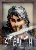 Joined: 13 Mar 2005
|
 Posted: Sat Dec 10, 2005 1:46 pm Posted: Sat Dec 10, 2005 1:46 pm
Post subject: |
  |
|
|
I would animate it to appear glowing. I would do it myself, but I have way to much crap on my hands to do it.
_________________
Motherfucking Triangles! Being all three sided n' shit, who do they think they are?!
|
|
|
|
Back to top
|
|
 |
Peachy PeteResident 8lb. Whore   Joined: 14 Mar 2005 Location: University Park, PA / Southborough, MA / West Falmouth, MA
|
Posted: Sat Dec 10, 2005 2:45 pm
Post subject: |
|
|
|
That stuff I said before.
_________________

"The computer can't tell you the emotional story. It can give you the exact mathematical design, but what's missing is the eyebrows." -Frank Zappa
3/30/2005 14:39:55 : # [Global] -=|CT|=- K9 Carlos: we're gonna auction your boat on Ebay
|
|
|
|
Back to top
|
|
|
D1rtboyDeckswab  Joined: 13 Mar 2005
|
Posted: Sat Dec 10, 2005 3:22 pm
Post subject: |
|
|
|
glowing sounds cool lol..
_________________
|
|
|
|
Back to top
|
|
|
firefox_71Old Fart  Joined: 16 Mar 2005 Location: D/FW
|
Posted: Sat Dec 10, 2005 8:04 pm
Post subject: |
|
|
|
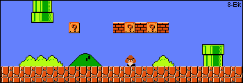
here is a 5 second quickie with a slight marble and an outer bevel, just to show you a simple form of getting the name to stand out from the rest
this was just a couple of clicks worth, you can do much to your banner 
doh, guess I could post the pic 
_________________


|
|
|
|
Back to top
|
|
|
BenderThe First Bi-Sexual (mostly gay) Robot Joined: 13 Mar 2005 Location: Planet Express Ship (flying over Canada)
|
Posted: Sat Dec 10, 2005 11:05 pm
Post subject: |
|
|
|
i'd also take out the black lines on the edges of the sig
_________________
Like most of life's problems, this one can be solved with bending.
2:50 AM - -=|CT|=- Dr. Crunk: whenever a girl is like "oh what are you thinking about"
2:50 AM - -=|CT|=- Dr. Crunk: i say nothing cause saying dudes wouldn't go over well
3:34 PM - El.Tawxic: I wish I was a horse
|
|
|
|
Back to top
|
|
|
CountChoculaWarning- may cause CountChoculitis  Joined: 16 Mar 2005 Location: sittin on my throne as the prince of bel-air
|
Posted: Sat Dec 10, 2005 11:33 pm
Post subject: |
|
|
|
| Bender wrote: | | i'd also take out the black lines on the edges of the sig |
banner*
_________________

| Quote: | [20:43] -≠∫ĆŤ∫≠- ŜρξčļαГ јỈмMﻻ: we'll aim for bender
[20:43] -≠∫ĆŤ∫≠- ŜρξčļαГ јỈмMﻻ: but use a lot of napalm
|
|
|
|
|
Back to top
|
|
|
D1rtboyDeckswab Joined: 13 Mar 2005
|
Posted: Sat Dec 10, 2005 11:33 pm
Post subject: |
|
|
|
| firefox_71 wrote: | here is a 5 second quickie with a slight marble and an outer bevel, just to show you a simple form of getting the name to stand out from the rest
this was just a couple of clicks worth, you can do much to your banner
doh, guess I could post the pic |
Oh that looks really nice.. and what are you talking about bender?
_________________
|
|
|
|
Back to top
|
|
|
firefox_71Old Fart Joined: 16 Mar 2005 Location: D/FW
|
Posted: Sat Dec 10, 2005 11:49 pm
Post subject: |
|
|
|
Bender is reffering to the two black bars on each end
_________________
|
|
|
|
Back to top
|
|
|
BenderThe First Bi-Sexual (mostly gay) Robot Joined: 13 Mar 2005 Location: Planet Express Ship (flying over Canada)
|
Posted: Sun Dec 11, 2005 1:18 am
Post subject: |
|
|
|
ya i dunno it just kind of looks out of place
_________________
Like most of life's problems, this one can be solved with bending.
2:50 AM - -=|CT|=- Dr. Crunk: whenever a girl is like "oh what are you thinking about"
2:50 AM - -=|CT|=- Dr. Crunk: i say nothing cause saying dudes wouldn't go over well
3:34 PM - El.Tawxic: I wish I was a horse
|
|
|
|
Back to top
|
|
|
ChrisTJohn Jameson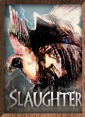 Joined: 16 Mar 2005
|
Posted: Sun Dec 11, 2005 2:27 am
Post subject: |
|
|
|

Crop Black Bars off (unecessary)
needs something added to much blank space I suggest your clan tag (-=|CT|=-)
background = boring Given background can't stand out to much or it will draw focus from other things, it still can have some texture/gradient to it personally I suggest a fade from black to light grey left black fading to right. This helps draw the eye from left to right along with the fade, name and picture.
It would also be hot if firefox made the text glow green: meh scratch that, you don't want to many people staring at your banner, or it will draw away from your actual website and will get tacky/ annoying after awhile.[/code]
_________________
Submit to Milky Way
|
|
|
|
Back to top
|
|
|
Peachy PeteResident 8lb. Whore Joined: 14 Mar 2005 Location: University Park, PA / Southborough, MA / West Falmouth, MA
|
Posted: Sun Dec 11, 2005 4:47 pm
Post subject: |
|
|
|
What I would do in your situation:
Before:
After:

Changes include:
-Cropping for smaller size of overall image
-Various changes to hue and saturation levels/brightness/contrast have been changed
-Re-imported render of the login portal and placed/sized it differently within the picture
-Changed size and brightness of the shield with the crossed axes in front of it (drew the eye too much before)
-Extended/blended some textures/colors in various places
-Made my own text with colors more related to the scheme (not sure if I totally like them
-Other minor changes
The big thing I noiticed is that you left the whole massive serpent thing that's in the portal out of your design... why would you do that if with your clan name being what it is?
Anyhoo, you're welcome to reproduce or just flat out use the changes I made.
_________________
"The computer can't tell you the emotional story. It can give you the exact mathematical design, but what's missing is the eyebrows." -Frank Zappa
3/30/2005 14:39:55 : # [Global] -=|CT|=- K9 Carlos: we're gonna auction your boat on Ebay
Last edited by Peachy Pete on Sun Dec 11, 2005 4:56 pm; edited 1 time in total
|
|
|
|
Back to top
|
|
|
CountChoculaWarning- may cause CountChoculitis Joined: 16 Mar 2005 Location: sittin on my throne as the prince of bel-air
|
Posted: Sun Dec 11, 2005 4:55 pm
Post subject: |
|
|
|
| Peachy Pete wrote: |
|
oooh.... pretty banner...
_________________
| Quote: | [20:43] -≠∫ĆŤ∫≠- ŜρξčļαГ јỈмMﻻ: we'll aim for bender
[20:43] -≠∫ĆŤ∫≠- ŜρξčļαГ јỈмMﻻ: but use a lot of napalm
|
|
|
|
|
Back to top
|
|
|
BenderThe First Bi-Sexual (mostly gay) Robot Joined: 13 Mar 2005 Location: Planet Express Ship (flying over Canada)
|
Posted: Sun Dec 11, 2005 5:26 pm
Post subject: |
|
|
|
| CountChocula wrote: | | Peachy Pete wrote: |
|
oooh.... pretty banner... |
ya only one thing, is it possible to like move the wall door opening thing with the statues behind the warcraft thing at the top, then move that pic a bit down so you can still see the snakes face?
_________________
Like most of life's problems, this one can be solved with bending.
2:50 AM - -=|CT|=- Dr. Crunk: whenever a girl is like "oh what are you thinking about"
2:50 AM - -=|CT|=- Dr. Crunk: i say nothing cause saying dudes wouldn't go over well
3:34 PM - El.Tawxic: I wish I was a horse
|
|
|
|
Back to top
|
|
|
Peachy PeteResident 8lb. Whore Joined: 14 Mar 2005 Location: University Park, PA / Southborough, MA / West Falmouth, MA
|
Posted: Sun Dec 11, 2005 6:35 pm
Post subject: |
|
|
|
No, I like how that looks better.
Also, I had to block out one of the heads of the state you put in the middle of the pic because I didn't feel like replicating the texture beneath it.
_________________
"The computer can't tell you the emotional story. It can give you the exact mathematical design, but what's missing is the eyebrows." -Frank Zappa
3/30/2005 14:39:55 : # [Global] -=|CT|=- K9 Carlos: we're gonna auction your boat on Ebay
|
|
|
|
Back to top
|
|
|
D1rtboyDeckswab Joined: 13 Mar 2005
|
Posted: Sun Dec 11, 2005 8:05 pm
Post subject: |
|
|
|
| Peachy Pete wrote: | What I would do in your situation:
Before:
After:
Changes include:
-Cropping for smaller size of overall image
-Various changes to hue and saturation levels/brightness/contrast have been changed
-Re-imported render of the login portal and placed/sized it differently within the picture
-Changed size and brightness of the shield with the crossed axes in front of it (drew the eye too much before)
-Extended/blended some textures/colors in various places
-Made my own text with colors more related to the scheme (not sure if I totally like them
-Other minor changes
The big thing I noiticed is that you left the whole massive serpent thing that's in the portal out of your design... why would you do that if with your clan name being what it is?
Anyhoo, you're welcome to reproduce or just flat out use the changes I made. |
Wow thats sweet.. I like the changes you did looks really nice! thanks!
_________________
|
|
|
|
Back to top
|
|
|
|
|